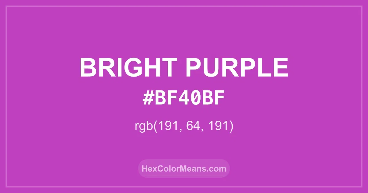
Bright Purple (#bf40bf) Color Information
Bright Purple (#bf40bf) RGB value is (191, 64, 191). The hex color red value is 191, green is 64, and blue is 191. Its HSL format shows a hue of 300°, saturation of 50%, and lightness of 50%, while the CMYK process values are 0%, 66%, 0%, and 25%.
Colors that pair well with Bright Purple (#bf40bf) include Royal Purple (#7851A9), Smitten (#C84186), and Yellow Green (#9ACD32), as they maintain visual balance and harmony, whereas Pear (#C9CC3F), Verdigris (#40B5AD), and Lime Green (#32CD32) tend to conflict with this color due to strong contrast or opposing tonal characteristics.

Bright Purple (#bf40bf) Color Meaning
Bright Purple (#BF40BF) is a vivid, bold purple with strong magenta undertones. It belongs to the vibrant purple family and conveys creativity, energy, and individuality. Designers often use Bright Purple in fashion, branding, and digital media to create striking visuals that demand attention. Its vivid tone gives designs an exciting and expressive edge. Historically, Bright Purple (#BF40BF) has been associated with innovation and modern artistic movements. Symbolically, it represents creativity, ambition, and imaginative thinking. Spiritually, bright purples evoke personal power, inspiration, and emotional vitality, often appearing in spaces or designs that encourage exploration and originality. Bright Purple (#BF40BF) symbolizes creativity, energy, and individuality. Across cultures, bold purple shades are linked to self-expression, luxury, and uniqueness. Its visual presence is commanding yet playful, ideal for designs seeking high impact. Interestingly, Bright Purple pairs beautifully with soft yellows, muted grays, or deep blues, creating dynamic and balanced compositions.
Color Conversion
Accurate conversions of Bright Purple (#bf40bf) across RGB, Hex, CMYK, HSL, and Lab ensure consistent color fidelity across digital, print, and design applications.
RGB Values & CMYK Values
Detailed RGB and CMYK values of Bright Purple (#bf40bf) displayed in a horizontal bar provide clear reference for digital and print color accuracy.
RGB Channels
CMYK Ink Density
Color Variations
A full range of Bright Purple (#bf40bf) variations, including tints, shades, and tones, provides highlights, depth, and subtle desaturated options for UI design.
Color Harmonies
Harmonious color schemes for Bright Purple (#bf40bf) created using the color wheel ensure visually balanced palettes.
Analogous
Colors adjacent on the color wheel (30° apart)
Complementary
Colors opposite on the color wheel (180° apart)
Split Complementary
Three colors using one base hue and the two hues beside its opposite
Triadic
Three colors evenly spaced (120° apart)
Tetradic
Four colors forming a rectangle on the wheel
Square
Four colors evenly spaced (90° apart)
Double Split Complementary
Four colors formed from two base hues and the colors next to their opposites
Monochromatic
Variations of a single hue
Contrast Checker (WCAG)
Luminance contrast ratios for Bright Purple (#bf40bf) against standard backgrounds ensure readable, accessible text following Contrast Checker and WCAG 2.1 AA/AAA standards.
Sample Text
This is how your text will look with these colors.
Large Text (18pt+)
Normal Text
UI Components
Color Blindness Simulator
Simulated views of Bright Purple (#bf40bf) for different color vision deficiencies help identify potential confusion using the Color Blindness Simulator.
Normal Vision
protanopia
Note: These simulations are approximations. Actual color vision deficiency varies by individual.
CSS Examples
Background Color
Text Color
Sample Text
Border Color
Box Shadow
Text Shadow
Sample Text
Gradient
Seamless Patterns
High-resolution seamless patterns featuring Bright Purple (#bf40bf) provide ready-to-use backgrounds, wallpapers, and print designs for any project.
Icons
A collection of popular icons in Bright Purple (#bf40bf) offers ready-to-use visuals for interfaces, designs, and creative projects.
Real-World Applications
Real-world mockups of Bright Purple (#bf40bf) showcase its versatility across fashion, interiors, branding, and product packaging.
Useful Color Tools
A curated set of tools to help apply, analyze, and manage colors effectively in your projects
Bright Purple (#bf40bf) Color FAQs
Frequently asked questions about Bright Purple (#bf40bf) color meaning, symbolism, and applications. Click on any question to expand detailed answers.