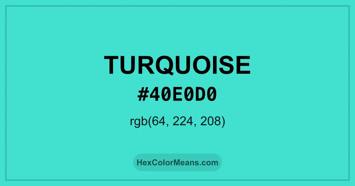
Turquoise (#40e0d0) Color Information
Turquoise (#40e0d0) RGB value is (64, 224, 208). The hex color red value is 64, green is 224, and blue is 208. Its HSL format shows a hue of 174°, saturation of 72%, and lightness of 56%, while the CMYK process values are 71%, 0%, 7%, and 12%.
Colors that pair well with Turquoise (#40e0d0) include UFO Green (#3CD070), Bright Ocean (#3E8EDE), and Pink (Pantone) (#D74894), as they maintain visual balance and harmony, whereas Steel Pink (#CC33CC), Sandstorm (#ECD540), and Desire (#EA3C53) tend to conflict with this color due to strong contrast or opposing tonal characteristics.

Turquoise (#40e0d0) Color Meaning
Turquoise (#40E0D0) belongs to the blue-green family with high brightness and freshness. It reflects light strongly and feels lively. This gives Turquoise (#40E0D0) a refreshing and open appearance. Designers often use it to energize calm palettes. Symbolism associated with Turquoise (#40E0D0) includes protection and renewal. It suggests flow rather than control. In color psychology, Turquoise (#40E0D0) encourages expression and emotional openness. That effect makes it popular in creative and wellness spaces. Historically, Turquoise (#40E0D0) held value in ancient Persian, Native American, and Tibetan traditions. The stone symbolized protection and life force. Jewelry and sacred objects carried this hue for centuries. These roots give Turquoise (#40E0D0) enduring meaning.
Color Conversion
Accurate conversions of Turquoise (#40e0d0) across RGB, Hex, CMYK, HSL, and Lab ensure consistent color fidelity across digital, print, and design applications.
RGB Values & CMYK Values
Detailed RGB and CMYK values of Turquoise (#40e0d0) displayed in a horizontal bar provide clear reference for digital and print color accuracy.
RGB Channels
CMYK Ink Density
Color Variations
A full range of Turquoise (#40e0d0) variations, including tints, shades, and tones, provides highlights, depth, and subtle desaturated options for UI design.
Color Harmonies
Harmonious color schemes for Turquoise (#40e0d0) created using the color wheel ensure visually balanced palettes.
Analogous
Colors adjacent on the color wheel (30° apart)
Complementary
Colors opposite on the color wheel (180° apart)
Split Complementary
Three colors using one base hue and the two hues beside its opposite
Triadic
Three colors evenly spaced (120° apart)
Tetradic
Four colors forming a rectangle on the wheel
Square
Four colors evenly spaced (90° apart)
Double Split Complementary
Four colors formed from two base hues and the colors next to their opposites
Monochromatic
Variations of a single hue
Contrast Checker (WCAG)
Luminance contrast ratios for Turquoise (#40e0d0) against standard backgrounds ensure readable, accessible text following Contrast Checker and WCAG 2.1 AA/AAA standards.
Sample Text
This is how your text will look with these colors.
Large Text (18pt+)
Normal Text
UI Components
Color Blindness Simulator
Simulated views of Turquoise (#40e0d0) for different color vision deficiencies help identify potential confusion using the Color Blindness Simulator.
Normal Vision
protanopia
Note: These simulations are approximations. Actual color vision deficiency varies by individual.
CSS Examples
Background Color
Text Color
Sample Text
Border Color
Box Shadow
Text Shadow
Sample Text
Gradient
Seamless Patterns
High-resolution seamless patterns featuring Turquoise (#40e0d0) provide ready-to-use backgrounds, wallpapers, and print designs for any project.
Icons
A collection of popular icons in Turquoise (#40e0d0) offers ready-to-use visuals for interfaces, designs, and creative projects.
Real-World Applications
Real-world mockups of Turquoise (#40e0d0) showcase its versatility across fashion, interiors, branding, and product packaging.
Useful Color Tools
A curated set of tools to help apply, analyze, and manage colors effectively in your projects
Turquoise (#40e0d0) Color FAQs
Frequently asked questions about Turquoise (#40e0d0) color meaning, symbolism, and applications. Click on any question to expand detailed answers.