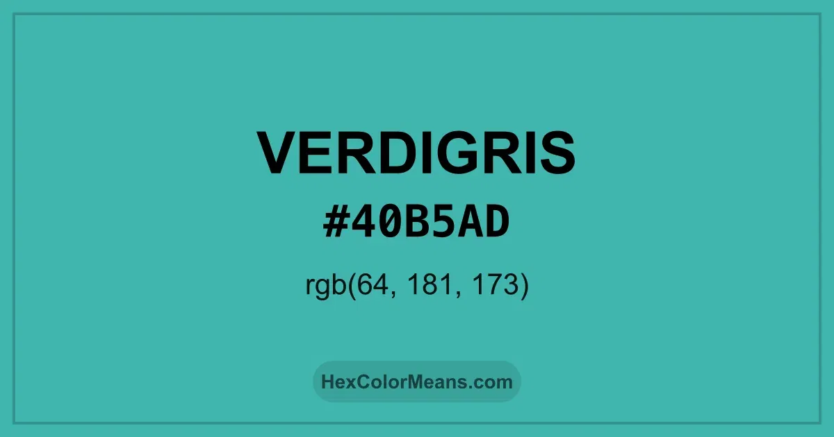
Verdigris (#40b5ad) Color Information
Verdigris (#40b5ad) RGB value is (64, 181, 173). The hex color red value is 64, green is 181, and blue is 173. Its HSL format shows a hue of 176°, saturation of 48%, and lightness of 48%, while the CMYK process values are 65%, 0%, 4%, and 29%.
Colors that pair well with Verdigris (#40b5ad) include Mint (#3EB489), Steel Blue (#4682B4), and Medium Red Violet (#BB3385), as they maintain visual balance and harmony, whereas Bright Purple (#BF40BF), Ochre Yellow (#AEA04B), and Deep Chestnut (#B94E48) tend to conflict with this color due to strong contrast or opposing tonal characteristics.

Verdigris (#40b5ad) Color Meaning
Verdigris (#40B5AD) belongs to the muted teal-green range with soft saturation. It resembles aged copper exposed to air and moisture. This gives Verdigris (#40B5AD) a weathered and organic character. Designers use it to suggest age with elegance. Symbolism around Verdigris (#40B5AD) reflects transformation and endurance. It shows beauty shaped by time. In color psychology, Verdigris (#40B5AD) appeals to those drawn to authenticity and depth. It feels lived-in rather than polished. Culturally, Verdigris (#40B5AD) appears in ancient architecture and sculpture across Europe and Asia. Patinated metals signaled longevity and resilience. Art preserved this tone as a mark of value. These associations give Verdigris (#40B5AD) quiet authority.
Color Conversion
Accurate conversions of Verdigris (#40b5ad) across RGB, Hex, CMYK, HSL, and Lab ensure consistent color fidelity across digital, print, and design applications.
RGB Values & CMYK Values
Detailed RGB and CMYK values of Verdigris (#40b5ad) displayed in a horizontal bar provide clear reference for digital and print color accuracy.
RGB Channels
CMYK Ink Density
Color Variations
A full range of Verdigris (#40b5ad) variations, including tints, shades, and tones, provides highlights, depth, and subtle desaturated options for UI design.
Color Harmonies
Harmonious color schemes for Verdigris (#40b5ad) created using the color wheel ensure visually balanced palettes.
Analogous
Colors adjacent on the color wheel (30° apart)
Complementary
Colors opposite on the color wheel (180° apart)
Split Complementary
Three colors using one base hue and the two hues beside its opposite
Triadic
Three colors evenly spaced (120° apart)
Tetradic
Four colors forming a rectangle on the wheel
Square
Four colors evenly spaced (90° apart)
Double Split Complementary
Four colors formed from two base hues and the colors next to their opposites
Monochromatic
Variations of a single hue
Contrast Checker (WCAG)
Luminance contrast ratios for Verdigris (#40b5ad) against standard backgrounds ensure readable, accessible text following Contrast Checker and WCAG 2.1 AA/AAA standards.
Sample Text
This is how your text will look with these colors.
Large Text (18pt+)
Normal Text
UI Components
Color Blindness Simulator
Simulated views of Verdigris (#40b5ad) for different color vision deficiencies help identify potential confusion using the Color Blindness Simulator.
Normal Vision
protanopia
Note: These simulations are approximations. Actual color vision deficiency varies by individual.
CSS Examples
Background Color
Text Color
Sample Text
Border Color
Box Shadow
Text Shadow
Sample Text
Gradient
Seamless Patterns
High-resolution seamless patterns featuring Verdigris (#40b5ad) provide ready-to-use backgrounds, wallpapers, and print designs for any project.
Icons
A collection of popular icons in Verdigris (#40b5ad) offers ready-to-use visuals for interfaces, designs, and creative projects.
Real-World Applications
Real-world mockups of Verdigris (#40b5ad) showcase its versatility across fashion, interiors, branding, and product packaging.
Useful Color Tools
A curated set of tools to help apply, analyze, and manage colors effectively in your projects
Verdigris (#40b5ad) Color FAQs
Frequently asked questions about Verdigris (#40b5ad) color meaning, symbolism, and applications. Click on any question to expand detailed answers.