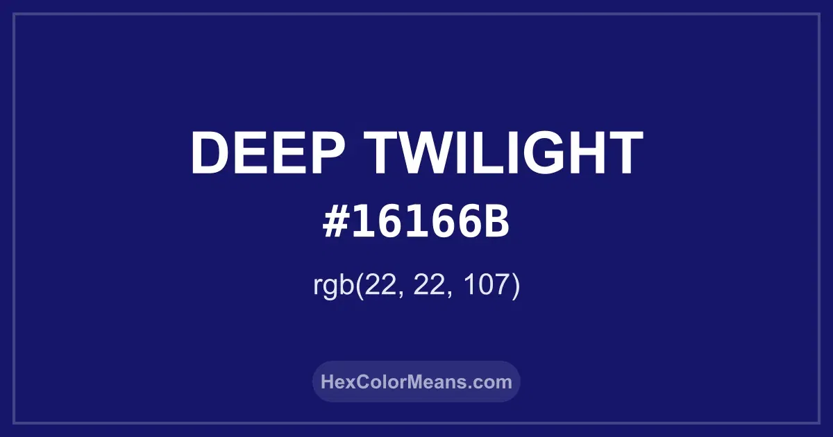
Deep Twilight (#16166b) Color Information
Deep Twilight (#16166b) RGB value is (22, 22, 107). The hex color red value is 22, green is 22, and blue is 107. Its HSL format shows a hue of 240°, saturation of 66%, and lightness of 25%, while the CMYK process values are 79%, 79%, 0%, and 58%.
Colors that pair well with Deep Twilight (#16166b) include Traffic Blue (#063971), Persian Indigo (#32127A), and Pullman Brown (UPS Brown) (#644117), as they maintain visual balance and harmony, whereas Prune (#701C1C), Deep Green (#056608), and Antique Bronze (#665D1E) tend to conflict with this color due to strong contrast or opposing tonal characteristics.

Deep Twilight (#16166b) Color Meaning
Deep Twilight (#16166B) is a near-black blue with faint violet depth. It belongs to night-inspired blues shaped by shadow. The shade feels introspective and protective. Deep Twilight (#16166B) reduces distraction. Symbolism associated with Deep Twilight (#16166B) includes mystery, containment, and inner awareness. It reflects boundaries and self-knowledge. The color supports solitude and focus. Deep Twilight (#16166B) carries quiet gravity. In art and literature, twilight blues symbolized transitions between states. The color marked endings and beginnings. Painters used it to frame silence. Deep Twilight (#16166B) still reflects inward strength.
Color Conversion
Accurate conversions of Deep Twilight (#16166b) across RGB, Hex, CMYK, HSL, and Lab ensure consistent color fidelity across digital, print, and design applications.
RGB Values & CMYK Values
Detailed RGB and CMYK values of Deep Twilight (#16166b) displayed in a horizontal bar provide clear reference for digital and print color accuracy.
RGB Channels
CMYK Ink Density
Color Variations
A full range of Deep Twilight (#16166b) variations, including tints, shades, and tones, provides highlights, depth, and subtle desaturated options for UI design.
Color Harmonies
Harmonious color schemes for Deep Twilight (#16166b) created using the color wheel ensure visually balanced palettes.
Analogous
Colors adjacent on the color wheel (30° apart)
Complementary
Colors opposite on the color wheel (180° apart)
Split Complementary
Three colors using one base hue and the two hues beside its opposite
Triadic
Three colors evenly spaced (120° apart)
Tetradic
Four colors forming a rectangle on the wheel
Square
Four colors evenly spaced (90° apart)
Double Split Complementary
Four colors formed from two base hues and the colors next to their opposites
Monochromatic
Variations of a single hue
Contrast Checker (WCAG)
Luminance contrast ratios for Deep Twilight (#16166b) against standard backgrounds ensure readable, accessible text following Contrast Checker and WCAG 2.1 AA/AAA standards.
Sample Text
This is how your text will look with these colors.
Large Text (18pt+)
Normal Text
UI Components
Color Blindness Simulator
Simulated views of Deep Twilight (#16166b) for different color vision deficiencies help identify potential confusion using the Color Blindness Simulator.
Normal Vision
protanopia
Note: These simulations are approximations. Actual color vision deficiency varies by individual.
CSS Examples
Background Color
Text Color
Sample Text
Border Color
Box Shadow
Text Shadow
Sample Text
Gradient
Seamless Patterns
High-resolution seamless patterns featuring Deep Twilight (#16166b) provide ready-to-use backgrounds, wallpapers, and print designs for any project.
Icons
A collection of popular icons in Deep Twilight (#16166b) offers ready-to-use visuals for interfaces, designs, and creative projects.
Real-World Applications
Real-world mockups of Deep Twilight (#16166b) showcase its versatility across fashion, interiors, branding, and product packaging.
Useful Color Tools
A curated set of tools to help apply, analyze, and manage colors effectively in your projects
Deep Twilight (#16166b) Color FAQs
Frequently asked questions about Deep Twilight (#16166b) color meaning, symbolism, and applications. Click on any question to expand detailed answers.