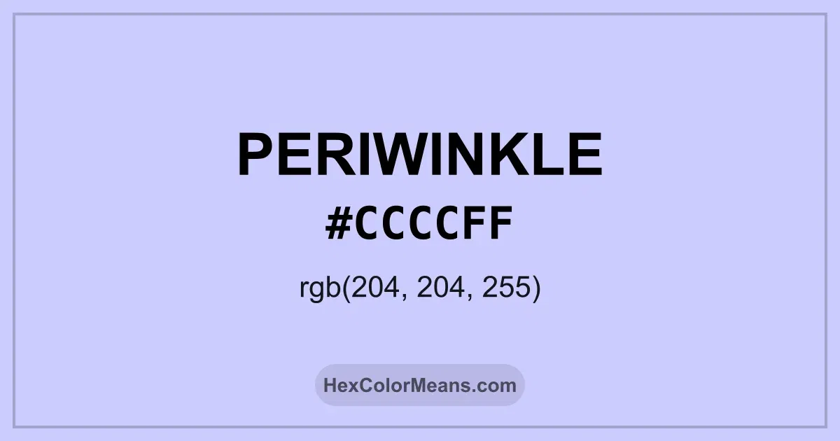
Periwinkle (#ccccff) Color Information
Periwinkle (#ccccff) RGB value is (204, 204, 255). The hex color red value is 204, green is 204, and blue is 255. Its HSL format shows a hue of 240°, saturation of 100%, and lightness of 90%, while the CMYK process values are 20%, 20%, 0%, and 0%.
Colors that pair well with Periwinkle (#ccccff) include Azureish White (#DBE9F4), Pale Lavender (#DCD0FF), and Lumber (#FFE4CD), as they maintain visual balance and harmony, whereas Bubble Gum (#FFC1CC), Tea Green (#D0F0C0), and Cream (#FFFDD0) tend to conflict with this color due to strong contrast or opposing tonal characteristics.

Periwinkle (#ccccff) Color Meaning
Periwinkle (#CCCCFF) sits between blue and lavender with noticeable softness. It carries more brightness than traditional blue. This blend gives Periwinkle (#CCCCFF) a dreamy and expressive feel. Artists often use it to soften structured palettes. Symbolism tied to Periwinkle (#CCCCFF) includes imagination and gentle optimism. It feels thoughtful without heaviness. In color psychology, Periwinkle (#CCCCFF) supports creativity and emotional balance. That mix makes it popular in artistic and reflective spaces. Historically, Periwinkle (#CCCCFF) took its name from the flower associated with remembrance and affection. European art used similar tones to suggest grace and sentiment. These roots give Periwinkle (#CCCCFF) a poetic and reflective depth.
Color Conversion
Accurate conversions of Periwinkle (#ccccff) across RGB, Hex, CMYK, HSL, and Lab ensure consistent color fidelity across digital, print, and design applications.
RGB Values & CMYK Values
Detailed RGB and CMYK values of Periwinkle (#ccccff) displayed in a horizontal bar provide clear reference for digital and print color accuracy.
RGB Channels
CMYK Ink Density
Color Variations
A full range of Periwinkle (#ccccff) variations, including tints, shades, and tones, provides highlights, depth, and subtle desaturated options for UI design.
Color Harmonies
Harmonious color schemes for Periwinkle (#ccccff) created using the color wheel ensure visually balanced palettes.
Analogous
Colors adjacent on the color wheel (30° apart)
Complementary
Colors opposite on the color wheel (180° apart)
Split Complementary
Three colors using one base hue and the two hues beside its opposite
Triadic
Three colors evenly spaced (120° apart)
Tetradic
Four colors forming a rectangle on the wheel
Square
Four colors evenly spaced (90° apart)
Double Split Complementary
Four colors formed from two base hues and the colors next to their opposites
Monochromatic
Variations of a single hue
Contrast Checker (WCAG)
Luminance contrast ratios for Periwinkle (#ccccff) against standard backgrounds ensure readable, accessible text following Contrast Checker and WCAG 2.1 AA/AAA standards.
Sample Text
This is how your text will look with these colors.
Large Text (18pt+)
Normal Text
UI Components
Color Blindness Simulator
Simulated views of Periwinkle (#ccccff) for different color vision deficiencies help identify potential confusion using the Color Blindness Simulator.
Normal Vision
protanopia
Note: These simulations are approximations. Actual color vision deficiency varies by individual.
CSS Examples
Background Color
Text Color
Sample Text
Border Color
Box Shadow
Text Shadow
Sample Text
Gradient
Seamless Patterns
High-resolution seamless patterns featuring Periwinkle (#ccccff) provide ready-to-use backgrounds, wallpapers, and print designs for any project.
Icons
A collection of popular icons in Periwinkle (#ccccff) offers ready-to-use visuals for interfaces, designs, and creative projects.
Real-World Applications
Real-world mockups of Periwinkle (#ccccff) showcase its versatility across fashion, interiors, branding, and product packaging.
Useful Color Tools
A curated set of tools to help apply, analyze, and manage colors effectively in your projects
Periwinkle (#ccccff) Color FAQs
Frequently asked questions about Periwinkle (#ccccff) color meaning, symbolism, and applications. Click on any question to expand detailed answers.