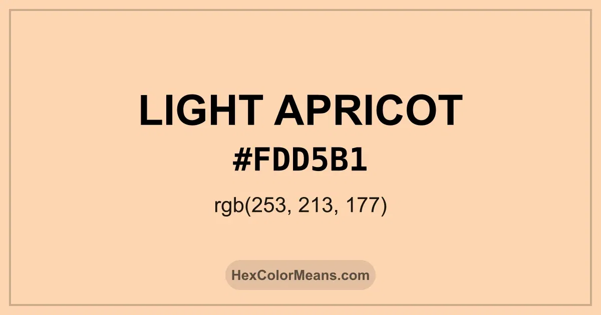
Light Apricot (#fdd5b1) Color Information
Light Apricot (#fdd5b1) RGB value is (253, 213, 177). The hex color red value is 253, green is 213, and blue is 177. Its HSL format shows a hue of 28°, saturation of 95%, and lightness of 84%, while the CMYK process values are 0%, 16%, 30%, and 1%.
Colors that pair well with Light Apricot (#fdd5b1) include Powder Blush (#FDBCB4), Pastel Yellow (#FFFAA0), and Italian Sky Blue (#B2FFFF), as they maintain visual balance and harmony, whereas Magic Mint (#AAF0D1), Mauve (#E0B0FF), and Icy Blue (#AFDBF5) tend to conflict with this color due to strong contrast or opposing tonal characteristics.

Light Apricot (#fdd5b1) Color Meaning
Light Apricot (#FDD5B1) belongs to the pale orange family with peach influence. This shade sits between blush and soft coral. Light Apricot (#FDD5B1) reflects warmth, care, and emotional openness. It feels welcoming and calm. Light Apricot (#FDD5B1) became popular in interior design and skincare branding. The color often appears in wellness and lifestyle spaces. Light Apricot (#FDD5B1) symbolizes tenderness and approachability. It avoids intensity. Light Apricot (#FDD5B1) aligns with heart and sacral spirituality, representing comfort and creativity. The tone supports emotional safety in color psychology. Light Apricot (#FDD5B1) appears in Mediterranean design culture. It represents hospitality and softness.
Color Conversion
Accurate conversions of Light Apricot (#fdd5b1) across RGB, Hex, CMYK, HSL, and Lab ensure consistent color fidelity across digital, print, and design applications.
RGB Values & CMYK Values
Detailed RGB and CMYK values of Light Apricot (#fdd5b1) displayed in a horizontal bar provide clear reference for digital and print color accuracy.
RGB Channels
CMYK Ink Density
Color Variations
A full range of Light Apricot (#fdd5b1) variations, including tints, shades, and tones, provides highlights, depth, and subtle desaturated options for UI design.
Color Harmonies
Harmonious color schemes for Light Apricot (#fdd5b1) created using the color wheel ensure visually balanced palettes.
Analogous
Colors adjacent on the color wheel (30° apart)
Complementary
Colors opposite on the color wheel (180° apart)
Split Complementary
Three colors using one base hue and the two hues beside its opposite
Triadic
Three colors evenly spaced (120° apart)
Tetradic
Four colors forming a rectangle on the wheel
Square
Four colors evenly spaced (90° apart)
Double Split Complementary
Four colors formed from two base hues and the colors next to their opposites
Monochromatic
Variations of a single hue
Contrast Checker (WCAG)
Luminance contrast ratios for Light Apricot (#fdd5b1) against standard backgrounds ensure readable, accessible text following Contrast Checker and WCAG 2.1 AA/AAA standards.
Sample Text
This is how your text will look with these colors.
Large Text (18pt+)
Normal Text
UI Components
Color Blindness Simulator
Simulated views of Light Apricot (#fdd5b1) for different color vision deficiencies help identify potential confusion using the Color Blindness Simulator.
Normal Vision
protanopia
Note: These simulations are approximations. Actual color vision deficiency varies by individual.
CSS Examples
Background Color
Text Color
Sample Text
Border Color
Box Shadow
Text Shadow
Sample Text
Gradient
Seamless Patterns
High-resolution seamless patterns featuring Light Apricot (#fdd5b1) provide ready-to-use backgrounds, wallpapers, and print designs for any project.
Icons
A collection of popular icons in Light Apricot (#fdd5b1) offers ready-to-use visuals for interfaces, designs, and creative projects.
Real-World Applications
Real-world mockups of Light Apricot (#fdd5b1) showcase its versatility across fashion, interiors, branding, and product packaging.
Useful Color Tools
A curated set of tools to help apply, analyze, and manage colors effectively in your projects
Light Apricot (#fdd5b1) Color FAQs
Frequently asked questions about Light Apricot (#fdd5b1) color meaning, symbolism, and applications. Click on any question to expand detailed answers.