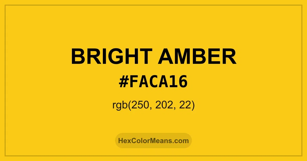
Bright Amber (#faca16) Color Information
Bright Amber (#faca16) RGB value is (250, 202, 22). The hex color red value is 250, green is 202, and blue is 22. Its HSL format shows a hue of 47°, saturation of 96%, and lightness of 53%, while the CMYK process values are 0%, 19%, 91%, and 2%.
Colors that pair well with Bright Amber (#faca16) include Orioles Orange (#FB4F14), Lemon Lime (#BFFF00), and Spiro Disco Ball (#0FC0FC), as they maintain visual balance and harmony, whereas Tropical Mint (#00FFBF), Vivid Orchid (#CC00FF), and Neon Blue (#1F51FF) tend to conflict with this color due to strong contrast or opposing tonal characteristics.

Bright Amber (#faca16) Color Meaning
Bright Amber (#FACA16) belongs to vivid golden yellows with warm undertones. It reflects concentrated sunlight and polished resin. The shade feels radiant and active. Bright Amber (#FACA16) carries visual warmth. Symbolically, Bright Amber (#FACA16) represents vitality, clarity, and purposeful energy. It signals forward motion and confidence. In color psychology, strong ambers stimulate motivation and focus. Bright Amber (#FACA16) feels driven. Culturally, amber pigments were valued for durability and glow. They appeared in trade goods and ornamentation. In modern design, Bright Amber (#FACA16) signals optimism and innovation. The color feels energized.
Color Conversion
Accurate conversions of Bright Amber (#faca16) across RGB, Hex, CMYK, HSL, and Lab ensure consistent color fidelity across digital, print, and design applications.
RGB Values & CMYK Values
Detailed RGB and CMYK values of Bright Amber (#faca16) displayed in a horizontal bar provide clear reference for digital and print color accuracy.
RGB Channels
CMYK Ink Density
Color Variations
A full range of Bright Amber (#faca16) variations, including tints, shades, and tones, provides highlights, depth, and subtle desaturated options for UI design.
Color Harmonies
Harmonious color schemes for Bright Amber (#faca16) created using the color wheel ensure visually balanced palettes.
Analogous
Colors adjacent on the color wheel (30° apart)
Complementary
Colors opposite on the color wheel (180° apart)
Split Complementary
Three colors using one base hue and the two hues beside its opposite
Triadic
Three colors evenly spaced (120° apart)
Tetradic
Four colors forming a rectangle on the wheel
Square
Four colors evenly spaced (90° apart)
Double Split Complementary
Four colors formed from two base hues and the colors next to their opposites
Monochromatic
Variations of a single hue
Contrast Checker (WCAG)
Luminance contrast ratios for Bright Amber (#faca16) against standard backgrounds ensure readable, accessible text following Contrast Checker and WCAG 2.1 AA/AAA standards.
Sample Text
This is how your text will look with these colors.
Large Text (18pt+)
Normal Text
UI Components
Color Blindness Simulator
Simulated views of Bright Amber (#faca16) for different color vision deficiencies help identify potential confusion using the Color Blindness Simulator.
Normal Vision
protanopia
Note: These simulations are approximations. Actual color vision deficiency varies by individual.
CSS Examples
Background Color
Text Color
Sample Text
Border Color
Box Shadow
Text Shadow
Sample Text
Gradient
Seamless Patterns
High-resolution seamless patterns featuring Bright Amber (#faca16) provide ready-to-use backgrounds, wallpapers, and print designs for any project.
Icons
A collection of popular icons in Bright Amber (#faca16) offers ready-to-use visuals for interfaces, designs, and creative projects.
Real-World Applications
Real-world mockups of Bright Amber (#faca16) showcase its versatility across fashion, interiors, branding, and product packaging.
Useful Color Tools
A curated set of tools to help apply, analyze, and manage colors effectively in your projects
Bright Amber (#faca16) Color FAQs
Frequently asked questions about Bright Amber (#faca16) color meaning, symbolism, and applications. Click on any question to expand detailed answers.