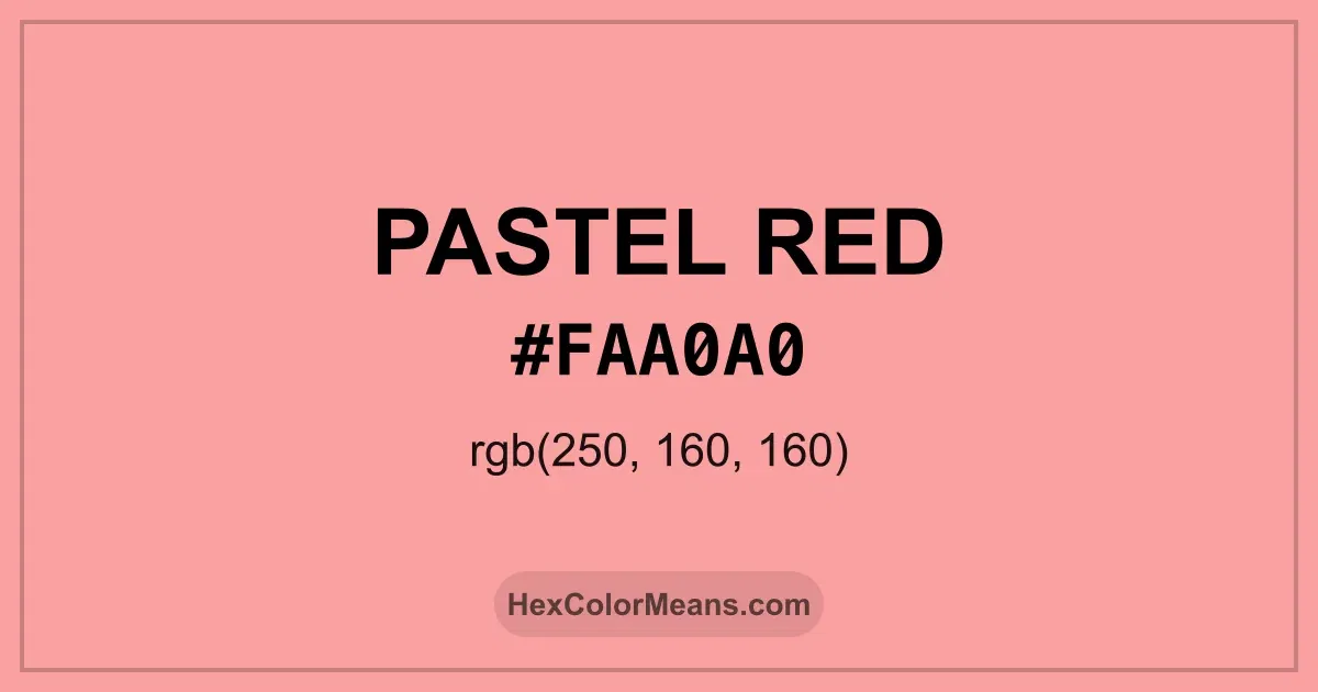
Pastel Red (#faa0a0) Color Information
Pastel Red (#faa0a0) RGB value is (250, 160, 160). The hex color red value is 250, green is 160, and blue is 160. Its HSL format shows a hue of 0°, saturation of 90%, and lightness of 80%, while the CMYK process values are 0%, 36%, 36%, and 2%.
Colors that pair well with Pastel Red (#faa0a0) include Pale Magenta-Pink (#FF99CC), Pastel Orange (#FAC898), and Magic Mint (#AAF0D1), as they maintain visual balance and harmony, whereas Mint Green (#98FB98), Soft Periwinkle (#9683EC), and Waterspout (#A4F4F9) tend to conflict with this color due to strong contrast or opposing tonal characteristics.

Pastel Red (#faa0a0) Color Meaning
Pastel Red (#FAA0A0) is a soft, muted red with pink undertones. It belongs to the pastel red family and conveys warmth, tenderness, and gentle energy. Designers often use Pastel Red in interiors, fashion, and lifestyle branding to evoke intimacy, comfort, and understated passion. Its delicate tone allows it to express emotion without intensity. Historically, Pastel Red (#FAA0A0) is reminiscent of natural dyes from fruits and flowers, often appearing in textiles, ceramics, and artwork. Symbolically, muted reds represent love, subtle power, and emotional balance. Spiritually, shades like Pastel Red evoke nurturing energy, compassion, and connection, making it suitable for restorative and intimate environments. Pastel Red (#FAA0A0) symbolizes affection, warmth, and subtle passion. Across cultures, soft red tones are associated with love, nurturing, and emotional sensitivity. Its visual presence is gentle and comforting, ideal for relaxed and harmonious designs. Interestingly, Pastel Red pairs beautifully with soft creams, muted greens, or light browns, creating compositions that feel tender and balanced.
Color Conversion
Accurate conversions of Pastel Red (#faa0a0) across RGB, Hex, CMYK, HSL, and Lab ensure consistent color fidelity across digital, print, and design applications.
RGB Values & CMYK Values
Detailed RGB and CMYK values of Pastel Red (#faa0a0) displayed in a horizontal bar provide clear reference for digital and print color accuracy.
RGB Channels
CMYK Ink Density
Color Variations
A full range of Pastel Red (#faa0a0) variations, including tints, shades, and tones, provides highlights, depth, and subtle desaturated options for UI design.
Color Harmonies
Harmonious color schemes for Pastel Red (#faa0a0) created using the color wheel ensure visually balanced palettes.
Analogous
Colors adjacent on the color wheel (30° apart)
Complementary
Colors opposite on the color wheel (180° apart)
Split Complementary
Three colors using one base hue and the two hues beside its opposite
Triadic
Three colors evenly spaced (120° apart)
Tetradic
Four colors forming a rectangle on the wheel
Square
Four colors evenly spaced (90° apart)
Double Split Complementary
Four colors formed from two base hues and the colors next to their opposites
Monochromatic
Variations of a single hue
Contrast Checker (WCAG)
Luminance contrast ratios for Pastel Red (#faa0a0) against standard backgrounds ensure readable, accessible text following Contrast Checker and WCAG 2.1 AA/AAA standards.
Sample Text
This is how your text will look with these colors.
Large Text (18pt+)
Normal Text
UI Components
Color Blindness Simulator
Simulated views of Pastel Red (#faa0a0) for different color vision deficiencies help identify potential confusion using the Color Blindness Simulator.
Normal Vision
protanopia
Note: These simulations are approximations. Actual color vision deficiency varies by individual.
CSS Examples
Background Color
Text Color
Sample Text
Border Color
Box Shadow
Text Shadow
Sample Text
Gradient
Seamless Patterns
High-resolution seamless patterns featuring Pastel Red (#faa0a0) provide ready-to-use backgrounds, wallpapers, and print designs for any project.
Icons
A collection of popular icons in Pastel Red (#faa0a0) offers ready-to-use visuals for interfaces, designs, and creative projects.
Real-World Applications
Real-world mockups of Pastel Red (#faa0a0) showcase its versatility across fashion, interiors, branding, and product packaging.
Useful Color Tools
A curated set of tools to help apply, analyze, and manage colors effectively in your projects
Pastel Red (#faa0a0) Color FAQs
Frequently asked questions about Pastel Red (#faa0a0) color meaning, symbolism, and applications. Click on any question to expand detailed answers.