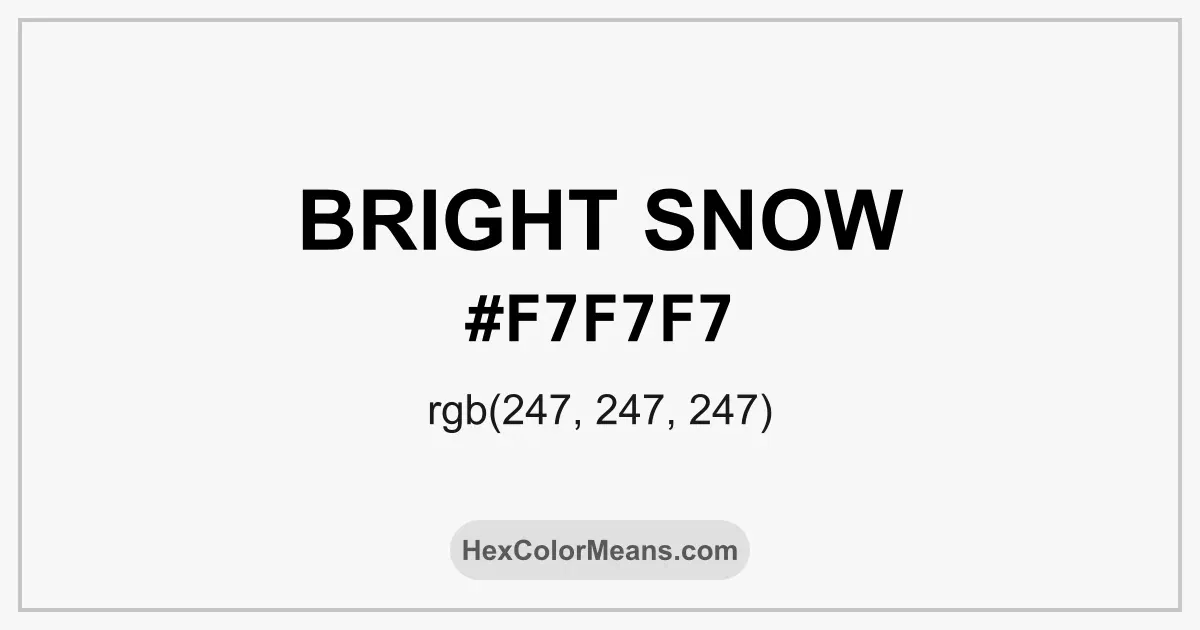
Bright Snow (#f7f7f7) Color Information
Bright Snow (#f7f7f7) RGB value is (247, 247, 247). The hex color red value is 247, green is 247, and blue is 247. Its HSL format shows a hue of 0°, saturation of 0%, and lightness of 97%, while the CMYK process values are 0%, 0%, 0%, and 3%.
Colors that pair well with Bright Snow (#f7f7f7) include , as they maintain visual balance and harmony, whereas tend to conflict with this color due to strong contrast or opposing tonal characteristics.

Bright Snow (#f7f7f7) Color Meaning
Bright Snow (#F7F7F7) belongs to the clean white family with a soft neutral base. It sits slightly away from pure white, which makes it easier on the eyes. The shade feels light, open, and controlled. Bright Snow (#F7F7F7) reflects space rather than glare. Symbolically, Bright Snow (#F7F7F7) represents clarity, honesty, and renewal. It often appears where order and structure matter. In color psychology, this tone supports focus and calm thinking. It clears visual clutter without feeling cold. Across cultures, Bright Snow (#F7F7F7) connects with cleanliness and fresh beginnings. In modern architecture, it signals precision and restraint. In Nordic regions, similar whites reflect snow covered landscapes and seasonal balance. Bright Snow (#F7F7F7) feels modern yet timeless.
Color Conversion
Accurate conversions of Bright Snow (#f7f7f7) across RGB, Hex, CMYK, HSL, and Lab ensure consistent color fidelity across digital, print, and design applications.
RGB Values & CMYK Values
Detailed RGB and CMYK values of Bright Snow (#f7f7f7) displayed in a horizontal bar provide clear reference for digital and print color accuracy.
RGB Channels
CMYK Ink Density
Color Variations
A full range of Bright Snow (#f7f7f7) variations, including tints, shades, and tones, provides highlights, depth, and subtle desaturated options for UI design.
Color Harmonies
Harmonious color schemes for Bright Snow (#f7f7f7) created using the color wheel ensure visually balanced palettes.
Analogous
Colors adjacent on the color wheel (30° apart)
Complementary
Colors opposite on the color wheel (180° apart)
Split Complementary
Three colors using one base hue and the two hues beside its opposite
Triadic
Three colors evenly spaced (120° apart)
Tetradic
Four colors forming a rectangle on the wheel
Square
Four colors evenly spaced (90° apart)
Double Split Complementary
Four colors formed from two base hues and the colors next to their opposites
Monochromatic
Variations of a single hue
Contrast Checker (WCAG)
Luminance contrast ratios for Bright Snow (#f7f7f7) against standard backgrounds ensure readable, accessible text following Contrast Checker and WCAG 2.1 AA/AAA standards.
Sample Text
This is how your text will look with these colors.
Large Text (18pt+)
Normal Text
UI Components
Color Blindness Simulator
Simulated views of Bright Snow (#f7f7f7) for different color vision deficiencies help identify potential confusion using the Color Blindness Simulator.
Normal Vision
protanopia
Note: These simulations are approximations. Actual color vision deficiency varies by individual.
CSS Examples
Background Color
Text Color
Sample Text
Border Color
Box Shadow
Text Shadow
Sample Text
Gradient
Seamless Patterns
High-resolution seamless patterns featuring Bright Snow (#f7f7f7) provide ready-to-use backgrounds, wallpapers, and print designs for any project.
Icons
A collection of popular icons in Bright Snow (#f7f7f7) offers ready-to-use visuals for interfaces, designs, and creative projects.
Real-World Applications
Real-world mockups of Bright Snow (#f7f7f7) showcase its versatility across fashion, interiors, branding, and product packaging.
Useful Color Tools
A curated set of tools to help apply, analyze, and manage colors effectively in your projects
Bright Snow (#f7f7f7) Color FAQs
Frequently asked questions about Bright Snow (#f7f7f7) color meaning, symbolism, and applications. Click on any question to expand detailed answers.