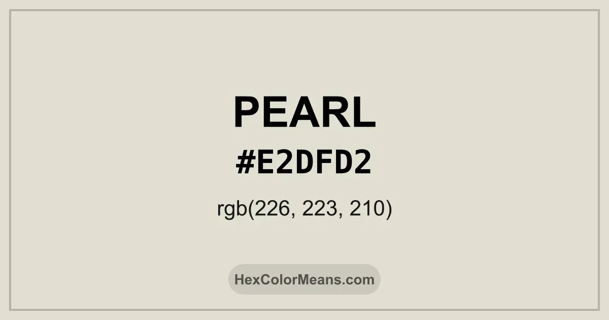
Pearl (#e2dfd2) Color Information
Pearl (#e2dfd2) RGB value is (226, 223, 210). The hex color red value is 226, green is 223, and blue is 210. Its HSL format shows a hue of 49°, saturation of 22%, and lightness of 85%, while the CMYK process values are 0%, 1%, 7%, and 11%.
Colors that pair well with Pearl (#e2dfd2) include Dust Grey (#DBD7D2), Columbia Blue (#C4D8E2), and Languid Lavender (#D6CADD), as they maintain visual balance and harmony, whereas Papyrus White (#D7D7D7), and Languid Lavender (#D6CADD) tend to conflict with this color due to strong contrast or opposing tonal characteristics.

Pearl (#e2dfd2) Color Meaning
Pearl (#E2DFD2) is a soft, muted white with gray and cream undertones, inspired by natural pearls. Its gentle sheen evokes sophistication, elegance, and understated beauty. Historically, pearl tones have been associated with luxury, refinement, and ceremonial use. In design, Pearl offers a calming, balanced presence that complements both light and darker hues. Symbolically, Pearl (#E2DFD2) represents purity, wisdom, and subtle luxury. It evokes serenity and introspection, making it ideal for spaces or designs that emphasize elegance without ostentation. Designers use Pearl to highlight textures and patterns, allowing other colors to stand out while maintaining harmony. In fashion, Pearl conveys grace and timeless sophistication. Culturally, Pearl (#E2DFD2) has long been associated with wealth, beauty, and status. Across Europe and Asia, pearls were worn as jewelry to signify refinement and ceremonial importance. In modern interiors and product design, Pearl is used to convey luxury, serenity, and soft sophistication, blending natural inspiration with contemporary aesthetics.
Color Conversion
Accurate conversions of Pearl (#e2dfd2) across RGB, Hex, CMYK, HSL, and Lab ensure consistent color fidelity across digital, print, and design applications.
RGB Values & CMYK Values
Detailed RGB and CMYK values of Pearl (#e2dfd2) displayed in a horizontal bar provide clear reference for digital and print color accuracy.
RGB Channels
CMYK Ink Density
Color Variations
A full range of Pearl (#e2dfd2) variations, including tints, shades, and tones, provides highlights, depth, and subtle desaturated options for UI design.
Color Harmonies
Harmonious color schemes for Pearl (#e2dfd2) created using the color wheel ensure visually balanced palettes.
Analogous
Colors adjacent on the color wheel (30° apart)
Complementary
Colors opposite on the color wheel (180° apart)
Split Complementary
Three colors using one base hue and the two hues beside its opposite
Triadic
Three colors evenly spaced (120° apart)
Tetradic
Four colors forming a rectangle on the wheel
Square
Four colors evenly spaced (90° apart)
Double Split Complementary
Four colors formed from two base hues and the colors next to their opposites
Monochromatic
Variations of a single hue
Contrast Checker (WCAG)
Luminance contrast ratios for Pearl (#e2dfd2) against standard backgrounds ensure readable, accessible text following Contrast Checker and WCAG 2.1 AA/AAA standards.
Sample Text
This is how your text will look with these colors.
Large Text (18pt+)
Normal Text
UI Components
Color Blindness Simulator
Simulated views of Pearl (#e2dfd2) for different color vision deficiencies help identify potential confusion using the Color Blindness Simulator.
Normal Vision
protanopia
Note: These simulations are approximations. Actual color vision deficiency varies by individual.
CSS Examples
Background Color
Text Color
Sample Text
Border Color
Box Shadow
Text Shadow
Sample Text
Gradient
Seamless Patterns
High-resolution seamless patterns featuring Pearl (#e2dfd2) provide ready-to-use backgrounds, wallpapers, and print designs for any project.
Icons
A collection of popular icons in Pearl (#e2dfd2) offers ready-to-use visuals for interfaces, designs, and creative projects.
Real-World Applications
Real-world mockups of Pearl (#e2dfd2) showcase its versatility across fashion, interiors, branding, and product packaging.
Useful Color Tools
A curated set of tools to help apply, analyze, and manage colors effectively in your projects
Pearl (#e2dfd2) Color FAQs
Frequently asked questions about Pearl (#e2dfd2) color meaning, symbolism, and applications. Click on any question to expand detailed answers.