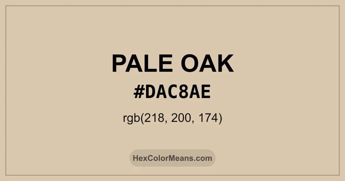
Pale Oak (#dac8ae) Color Information
Pale Oak (#dac8ae) RGB value is (218, 200, 174). The hex color red value is 218, green is 200, and blue is 174. Its HSL format shows a hue of 35°, saturation of 37%, and lightness of 77%, while the CMYK process values are 0%, 8%, 20%, and 15%.
Colors that pair well with Pale Oak (#dac8ae) include Pale Chestnut (#DDADAF), Powder Blue (#B6D0E2), and Wisteria (#BDB5D5), as they maintain visual balance and harmony, whereas Seafoam Green (#9FE2BF), Pastel Purple (#C3B1E1), and Pastel Blue (#AEC6CF) tend to conflict with this color due to strong contrast or opposing tonal characteristics.

Pale Oak (#dac8ae) Color Meaning
Pale Oak (#DAC8AE) sits within soft beige tones with faint warm undertones. It mirrors aged wood, light timber, and weathered oak. The shade feels gentle, balanced, and refined. Pale Oak (#DAC8AE) conveys understated elegance. Symbolically, Pale Oak (#DAC8AE) represents clarity, calm, and reliability. It signals composure, patience, and simplicity. In color psychology, pale neutrals promote focus, serenity, and comfort. Pale Oak (#DAC8AE) feels steady and harmonious. Culturally, oak-inspired pale tones appear in furniture, interiors, and traditional crafts. They signify durability, heritage, and quiet sophistication. In contemporary design, Pale Oak (#DAC8AE) anchors palettes while softening contrast. The color feels warm, neutral, and timeless.
Color Conversion
Accurate conversions of Pale Oak (#dac8ae) across RGB, Hex, CMYK, HSL, and Lab ensure consistent color fidelity across digital, print, and design applications.
RGB Values & CMYK Values
Detailed RGB and CMYK values of Pale Oak (#dac8ae) displayed in a horizontal bar provide clear reference for digital and print color accuracy.
RGB Channels
CMYK Ink Density
Color Variations
A full range of Pale Oak (#dac8ae) variations, including tints, shades, and tones, provides highlights, depth, and subtle desaturated options for UI design.
Color Harmonies
Harmonious color schemes for Pale Oak (#dac8ae) created using the color wheel ensure visually balanced palettes.
Analogous
Colors adjacent on the color wheel (30° apart)
Complementary
Colors opposite on the color wheel (180° apart)
Split Complementary
Three colors using one base hue and the two hues beside its opposite
Triadic
Three colors evenly spaced (120° apart)
Tetradic
Four colors forming a rectangle on the wheel
Square
Four colors evenly spaced (90° apart)
Double Split Complementary
Four colors formed from two base hues and the colors next to their opposites
Monochromatic
Variations of a single hue
Contrast Checker (WCAG)
Luminance contrast ratios for Pale Oak (#dac8ae) against standard backgrounds ensure readable, accessible text following Contrast Checker and WCAG 2.1 AA/AAA standards.
Sample Text
This is how your text will look with these colors.
Large Text (18pt+)
Normal Text
UI Components
Color Blindness Simulator
Simulated views of Pale Oak (#dac8ae) for different color vision deficiencies help identify potential confusion using the Color Blindness Simulator.
Normal Vision
protanopia
Note: These simulations are approximations. Actual color vision deficiency varies by individual.
CSS Examples
Background Color
Text Color
Sample Text
Border Color
Box Shadow
Text Shadow
Sample Text
Gradient
Seamless Patterns
High-resolution seamless patterns featuring Pale Oak (#dac8ae) provide ready-to-use backgrounds, wallpapers, and print designs for any project.
Icons
A collection of popular icons in Pale Oak (#dac8ae) offers ready-to-use visuals for interfaces, designs, and creative projects.
Real-World Applications
Real-world mockups of Pale Oak (#dac8ae) showcase its versatility across fashion, interiors, branding, and product packaging.
Useful Color Tools
A curated set of tools to help apply, analyze, and manage colors effectively in your projects
Pale Oak (#dac8ae) Color FAQs
Frequently asked questions about Pale Oak (#dac8ae) color meaning, symbolism, and applications. Click on any question to expand detailed answers.