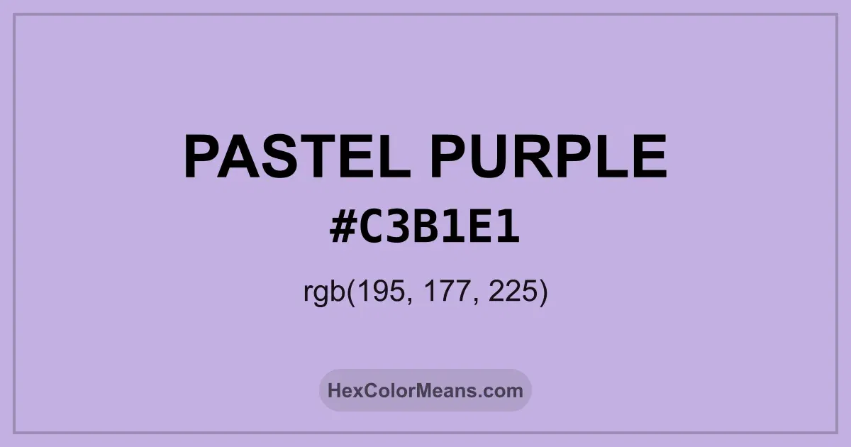
Pastel Purple (#c3b1e1) Color Information
Pastel Purple (#c3b1e1) RGB value is (195, 177, 225). The hex color red value is 195, green is 177, and blue is 225. Its HSL format shows a hue of 263°, saturation of 44%, and lightness of 79%, while the CMYK process values are 13%, 21%, 0%, and 12%.
Colors that pair well with Pastel Purple (#c3b1e1) include Wisteria (#BDB5D5), Pink Orchid (#DBB2D1), and Dutch White (#EFDFBB), as they maintain visual balance and harmony, whereas Rose Gold (#E0BFB8), and Pastel Green (#C1E1C1) tend to conflict with this color due to strong contrast or opposing tonal characteristics.

Pastel Purple (#c3b1e1) Color Meaning
Pastel Purple (#C3B1E1) is a light, airy shade of purple, blending the calmness of blue and the energy of red into a soft, gentle tone. Its high lightness level and subtle cool undertones make it soothing to the eye. Historically, pastel purples have been used in fabrics and paintings to symbolize gentleness, youth, and creativity. The color is widely seen in weddings, spring designs, and digital media to convey friendliness and approachability. Pastel Purple (#C3B1E1) symbolizes creativity, sensitivity, and calm. Artists and designers use it to evoke dreamy, reflective moods. In living spaces, it promotes calmness and thoughtful energy. Its lightness makes it a favorite in feminine design, yet it remains versatile enough for modern, minimalist settings. Pastel Purple encourages introspection without the intensity of deeper purples, making it ideal for both personal expression and aesthetic balance. Across cultures, Pastel Purple (#C3B1E1) carries diverse significance. In Western societies, it represents charm, delicacy, and refinement, often used in celebrations and decorative arts. Japanese and Korean design traditions employ similar shades to evoke softness and elegance in seasonal motifs. The color is also gaining recognition in digital branding as a gentle yet sophisticated accent, bridging historical association with contemporary trends.
Color Conversion
Accurate conversions of Pastel Purple (#c3b1e1) across RGB, Hex, CMYK, HSL, and Lab ensure consistent color fidelity across digital, print, and design applications.
RGB Values & CMYK Values
Detailed RGB and CMYK values of Pastel Purple (#c3b1e1) displayed in a horizontal bar provide clear reference for digital and print color accuracy.
RGB Channels
CMYK Ink Density
Color Variations
A full range of Pastel Purple (#c3b1e1) variations, including tints, shades, and tones, provides highlights, depth, and subtle desaturated options for UI design.
Color Harmonies
Harmonious color schemes for Pastel Purple (#c3b1e1) created using the color wheel ensure visually balanced palettes.
Analogous
Colors adjacent on the color wheel (30° apart)
Complementary
Colors opposite on the color wheel (180° apart)
Split Complementary
Three colors using one base hue and the two hues beside its opposite
Triadic
Three colors evenly spaced (120° apart)
Tetradic
Four colors forming a rectangle on the wheel
Square
Four colors evenly spaced (90° apart)
Double Split Complementary
Four colors formed from two base hues and the colors next to their opposites
Monochromatic
Variations of a single hue
Contrast Checker (WCAG)
Luminance contrast ratios for Pastel Purple (#c3b1e1) against standard backgrounds ensure readable, accessible text following Contrast Checker and WCAG 2.1 AA/AAA standards.
Sample Text
This is how your text will look with these colors.
Large Text (18pt+)
Normal Text
UI Components
Color Blindness Simulator
Simulated views of Pastel Purple (#c3b1e1) for different color vision deficiencies help identify potential confusion using the Color Blindness Simulator.
Normal Vision
protanopia
Note: These simulations are approximations. Actual color vision deficiency varies by individual.
CSS Examples
Background Color
Text Color
Sample Text
Border Color
Box Shadow
Text Shadow
Sample Text
Gradient
Seamless Patterns
High-resolution seamless patterns featuring Pastel Purple (#c3b1e1) provide ready-to-use backgrounds, wallpapers, and print designs for any project.
Icons
A collection of popular icons in Pastel Purple (#c3b1e1) offers ready-to-use visuals for interfaces, designs, and creative projects.
Real-World Applications
Real-world mockups of Pastel Purple (#c3b1e1) showcase its versatility across fashion, interiors, branding, and product packaging.
Useful Color Tools
A curated set of tools to help apply, analyze, and manage colors effectively in your projects
Pastel Purple (#c3b1e1) Color FAQs
Frequently asked questions about Pastel Purple (#c3b1e1) color meaning, symbolism, and applications. Click on any question to expand detailed answers.