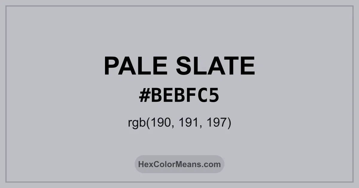
Pale Slate (#bebfc5) Color Information
Pale Slate (#bebfc5) RGB value is (190, 191, 197). The hex color red value is 190, green is 191, and blue is 197. Its HSL format shows a hue of 231°, saturation of 6%, and lightness of 76%, while the CMYK process values are 4%, 3%, 0%, and 23%.
Colors that pair well with Pale Slate (#bebfc5) include Silver Sand (#BFC1C2), Pale Silver (#C9C0BB), and Silver (#C0C0C0), as they maintain visual balance and harmony, whereas Silver (#C0C0C0), and Pale Silver (#C9C0BB) tend to conflict with this color due to strong contrast or opposing tonal characteristics.

Pale Slate (#bebfc5) Color Meaning
Pale Slate (#BEBFC5) sits between light grey and cool blue. It carries a mineral like softness. The shade feels controlled and thoughtful. Pale Slate (#BEBFC5) suggests quiet intelligence. Symbolically, Pale Slate (#BEBFC5) represents reflection and balance. It avoids emotional extremes. In psychology based color theory, blue greys encourage logic and clear communication. Pale Slate (#BEBFC5) supports concentration. Historically, slate colors appear in roofing, stonework, and manuscripts. In British architecture, similar hues reflect overcast skies and durability. In digital design, Pale Slate (#BEBFC5) signals neutrality and trust. It feels reliable.
Color Conversion
Accurate conversions of Pale Slate (#bebfc5) across RGB, Hex, CMYK, HSL, and Lab ensure consistent color fidelity across digital, print, and design applications.
RGB Values & CMYK Values
Detailed RGB and CMYK values of Pale Slate (#bebfc5) displayed in a horizontal bar provide clear reference for digital and print color accuracy.
RGB Channels
CMYK Ink Density
Color Variations
A full range of Pale Slate (#bebfc5) variations, including tints, shades, and tones, provides highlights, depth, and subtle desaturated options for UI design.
Color Harmonies
Harmonious color schemes for Pale Slate (#bebfc5) created using the color wheel ensure visually balanced palettes.
Analogous
Colors adjacent on the color wheel (30° apart)
Complementary
Colors opposite on the color wheel (180° apart)
Split Complementary
Three colors using one base hue and the two hues beside its opposite
Triadic
Three colors evenly spaced (120° apart)
Tetradic
Four colors forming a rectangle on the wheel
Square
Four colors evenly spaced (90° apart)
Double Split Complementary
Four colors formed from two base hues and the colors next to their opposites
Monochromatic
Variations of a single hue
Contrast Checker (WCAG)
Luminance contrast ratios for Pale Slate (#bebfc5) against standard backgrounds ensure readable, accessible text following Contrast Checker and WCAG 2.1 AA/AAA standards.
Sample Text
This is how your text will look with these colors.
Large Text (18pt+)
Normal Text
UI Components
Color Blindness Simulator
Simulated views of Pale Slate (#bebfc5) for different color vision deficiencies help identify potential confusion using the Color Blindness Simulator.
Normal Vision
protanopia
Note: These simulations are approximations. Actual color vision deficiency varies by individual.
CSS Examples
Background Color
Text Color
Sample Text
Border Color
Box Shadow
Text Shadow
Sample Text
Gradient
Seamless Patterns
High-resolution seamless patterns featuring Pale Slate (#bebfc5) provide ready-to-use backgrounds, wallpapers, and print designs for any project.
Icons
A collection of popular icons in Pale Slate (#bebfc5) offers ready-to-use visuals for interfaces, designs, and creative projects.
Real-World Applications
Real-world mockups of Pale Slate (#bebfc5) showcase its versatility across fashion, interiors, branding, and product packaging.
Useful Color Tools
A curated set of tools to help apply, analyze, and manage colors effectively in your projects
Pale Slate (#bebfc5) Color FAQs
Frequently asked questions about Pale Slate (#bebfc5) color meaning, symbolism, and applications. Click on any question to expand detailed answers.