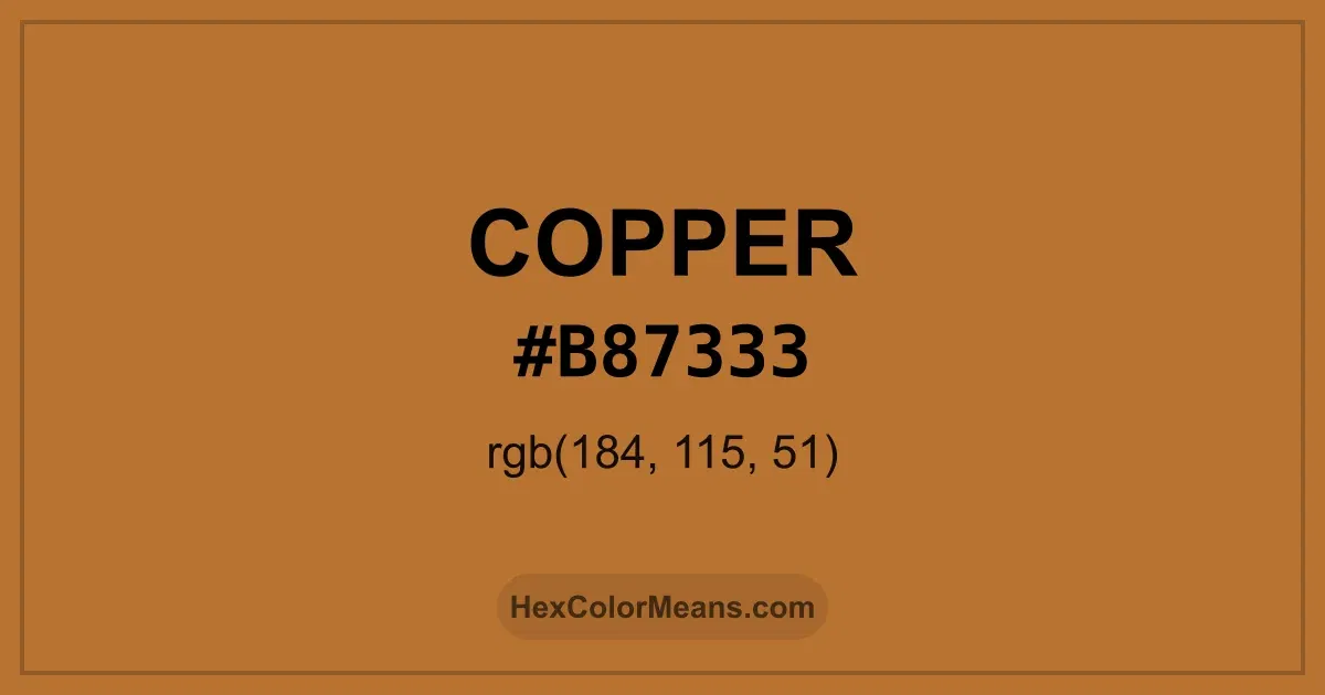
Copper (#b87333) Color Information
Copper (#b87333) RGB value is (184, 115, 51). The hex color red value is 184, green is 115, and blue is 51. Its HSL format shows a hue of 29°, saturation of 57%, and lightness of 46%, while the CMYK process values are 0%, 38%, 72%, and 28%.
Colors that pair well with Copper (#b87333) include Int. Orange (Golden Gate Bridge) (#C0362C), Peridot (#B4C424), and Verdigris (#40B5AD), as they maintain visual balance and harmony, whereas Mint (#3EB489), Indigo Bloom (#6F2DA8), and Light Blue (#3B83BD) tend to conflict with this color due to strong contrast or opposing tonal characteristics.

Copper (#b87333) Color Meaning
Copper (#B87333) belongs to the metallic orange-brown family with natural luminosity. It carries brightness and warmth without overwhelming saturation. This gives Copper (#B87333) a lively, reflective presence. It appears often in industrial design, jewelry, and architectural details. Symbolism linked to Copper (#B87333) includes durability, energy, and transformation. It feels active and elemental. In color psychology, Copper (#B87333) promotes motivation and grounded creativity. People often read it as both strong and inviting. Historically, Copper (#B87333) reflects the metal itself, used for tools, currency, and art for millennia. Its warm, glowing hue conveys resilience and human ingenuity. These associations give Copper (#B87333) a timeless and enduring character.
Color Conversion
Accurate conversions of Copper (#b87333) across RGB, Hex, CMYK, HSL, and Lab ensure consistent color fidelity across digital, print, and design applications.
RGB Values & CMYK Values
Detailed RGB and CMYK values of Copper (#b87333) displayed in a horizontal bar provide clear reference for digital and print color accuracy.
RGB Channels
CMYK Ink Density
Color Variations
A full range of Copper (#b87333) variations, including tints, shades, and tones, provides highlights, depth, and subtle desaturated options for UI design.
Color Harmonies
Harmonious color schemes for Copper (#b87333) created using the color wheel ensure visually balanced palettes.
Analogous
Colors adjacent on the color wheel (30° apart)
Complementary
Colors opposite on the color wheel (180° apart)
Split Complementary
Three colors using one base hue and the two hues beside its opposite
Triadic
Three colors evenly spaced (120° apart)
Tetradic
Four colors forming a rectangle on the wheel
Square
Four colors evenly spaced (90° apart)
Double Split Complementary
Four colors formed from two base hues and the colors next to their opposites
Monochromatic
Variations of a single hue
Contrast Checker (WCAG)
Luminance contrast ratios for Copper (#b87333) against standard backgrounds ensure readable, accessible text following Contrast Checker and WCAG 2.1 AA/AAA standards.
Sample Text
This is how your text will look with these colors.
Large Text (18pt+)
Normal Text
UI Components
Color Blindness Simulator
Simulated views of Copper (#b87333) for different color vision deficiencies help identify potential confusion using the Color Blindness Simulator.
Normal Vision
protanopia
Note: These simulations are approximations. Actual color vision deficiency varies by individual.
CSS Examples
Background Color
Text Color
Sample Text
Border Color
Box Shadow
Text Shadow
Sample Text
Gradient
Seamless Patterns
High-resolution seamless patterns featuring Copper (#b87333) provide ready-to-use backgrounds, wallpapers, and print designs for any project.
Icons
A collection of popular icons in Copper (#b87333) offers ready-to-use visuals for interfaces, designs, and creative projects.
Real-World Applications
Real-world mockups of Copper (#b87333) showcase its versatility across fashion, interiors, branding, and product packaging.
Useful Color Tools
A curated set of tools to help apply, analyze, and manage colors effectively in your projects
Copper (#b87333) Color FAQs
Frequently asked questions about Copper (#b87333) color meaning, symbolism, and applications. Click on any question to expand detailed answers.