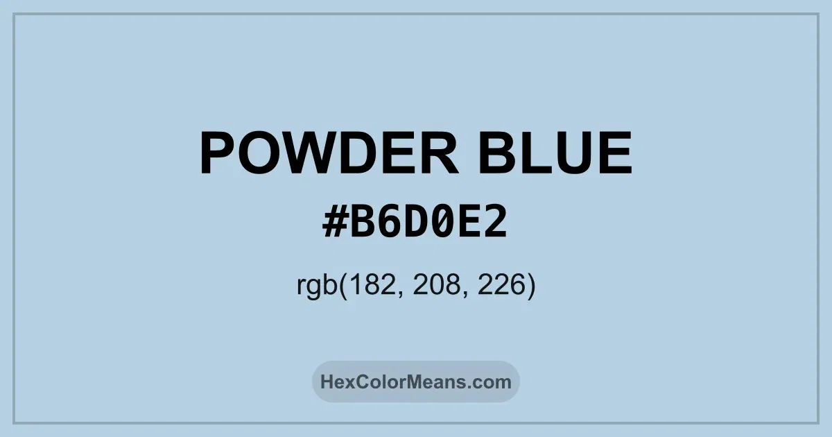
Powder Blue (#b6d0e2) Color Information
Powder Blue (#b6d0e2) RGB value is (182, 208, 226). The hex color red value is 182, green is 208, and blue is 226. Its HSL format shows a hue of 205°, saturation of 43%, and lightness of 80%, while the CMYK process values are 19%, 8%, 0%, and 11%.
Colors that pair well with Powder Blue (#b6d0e2) include Light Blue (#ADD8E6), Wisteria (#BDB5D5), and Rose Gold (#E0BFB8), as they maintain visual balance and harmony, whereas Pink Orchid (#DBB2D1), Tea Green (#D0F0C0), and Rose Gold (#E0BFB8) tend to conflict with this color due to strong contrast or opposing tonal characteristics.

Powder Blue (#b6d0e2) Color Meaning
Powder Blue (#B6D0E2) belongs to the pale blue category with muted saturation. It appears smooth and understated. This restraint gives Powder Blue (#B6D0E2) a refined and calming presence. Therefore, it fits well in professional and restorative environments. Symbolism associated with Powder Blue (#B6D0E2) centers on composure and cleanliness. It removes visual tension. In color psychology, Powder Blue (#B6D0E2) supports calm focus and gentle order. People often view it as dependable and polite. Psychologically, Powder Blue (#B6D0E2) reduces visual stress and promotes ease. Healthcare and educational spaces rely on it for this effect. Across design fields, it signals care without emotion overload. These traits keep Powder Blue (#B6D0E2) quietly effective.
Color Conversion
Accurate conversions of Powder Blue (#b6d0e2) across RGB, Hex, CMYK, HSL, and Lab ensure consistent color fidelity across digital, print, and design applications.
RGB Values & CMYK Values
Detailed RGB and CMYK values of Powder Blue (#b6d0e2) displayed in a horizontal bar provide clear reference for digital and print color accuracy.
RGB Channels
CMYK Ink Density
Color Variations
A full range of Powder Blue (#b6d0e2) variations, including tints, shades, and tones, provides highlights, depth, and subtle desaturated options for UI design.
Color Harmonies
Harmonious color schemes for Powder Blue (#b6d0e2) created using the color wheel ensure visually balanced palettes.
Analogous
Colors adjacent on the color wheel (30° apart)
Complementary
Colors opposite on the color wheel (180° apart)
Split Complementary
Three colors using one base hue and the two hues beside its opposite
Triadic
Three colors evenly spaced (120° apart)
Tetradic
Four colors forming a rectangle on the wheel
Square
Four colors evenly spaced (90° apart)
Double Split Complementary
Four colors formed from two base hues and the colors next to their opposites
Monochromatic
Variations of a single hue
Contrast Checker (WCAG)
Luminance contrast ratios for Powder Blue (#b6d0e2) against standard backgrounds ensure readable, accessible text following Contrast Checker and WCAG 2.1 AA/AAA standards.
Sample Text
This is how your text will look with these colors.
Large Text (18pt+)
Normal Text
UI Components
Color Blindness Simulator
Simulated views of Powder Blue (#b6d0e2) for different color vision deficiencies help identify potential confusion using the Color Blindness Simulator.
Normal Vision
protanopia
Note: These simulations are approximations. Actual color vision deficiency varies by individual.
CSS Examples
Background Color
Text Color
Sample Text
Border Color
Box Shadow
Text Shadow
Sample Text
Gradient
Seamless Patterns
High-resolution seamless patterns featuring Powder Blue (#b6d0e2) provide ready-to-use backgrounds, wallpapers, and print designs for any project.
Icons
A collection of popular icons in Powder Blue (#b6d0e2) offers ready-to-use visuals for interfaces, designs, and creative projects.
Real-World Applications
Real-world mockups of Powder Blue (#b6d0e2) showcase its versatility across fashion, interiors, branding, and product packaging.
Useful Color Tools
A curated set of tools to help apply, analyze, and manage colors effectively in your projects
Powder Blue (#b6d0e2) Color FAQs
Frequently asked questions about Powder Blue (#b6d0e2) color meaning, symbolism, and applications. Click on any question to expand detailed answers.