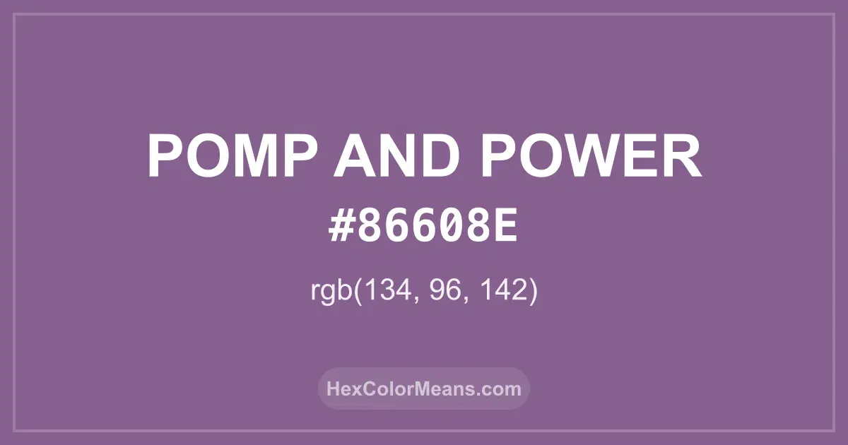
Pomp and Power (#86608e) Color Information
Pomp and Power (#86608e) RGB value is (134, 96, 142). The hex color red value is 134, green is 96, and blue is 142. Its HSL format shows a hue of 290°, saturation of 19%, and lightness of 47%, while the CMYK process values are 6%, 32%, 0%, and 44%.
Colors that pair well with Pomp and Power (#86608e) include Dark Blue-Gray (#666699), Antique Fuchsia (#915C83), and Camouflage Green (#78866B), as they maintain visual balance and harmony, whereas Yellow Grey (#8F8B66), Eucalyptus (#5F8575), and Russian Green (#679267) tend to conflict with this color due to strong contrast or opposing tonal characteristics.

Pomp and Power (#86608e) Color Meaning
Pomp and Power (#86608E) is a muted, medium purple with subtle gray undertones. It belongs to the purple family, blending authority with understated elegance. Historically, muted purples were linked to sophistication and ceremonial use, representing nobility and artistic refinement. The color symbolizes dignity, creativity, and introspection. Pomp and Power (#86608E) works well in interiors, fashion, and branding where elegance and thoughtfulness are desired. Its muted tone balances power with calm, making it versatile for professional or artistic spaces. Across cultures, purple represents wisdom, nobility, and spiritual insight. Pomp and Power (#86608E) evokes creative reflection, introspection, and quiet confidence. Its depth makes it ideal for meditation spaces, sophisticated design, or artistic expression.
Color Conversion
Accurate conversions of Pomp and Power (#86608e) across RGB, Hex, CMYK, HSL, and Lab ensure consistent color fidelity across digital, print, and design applications.
RGB Values & CMYK Values
Detailed RGB and CMYK values of Pomp and Power (#86608e) displayed in a horizontal bar provide clear reference for digital and print color accuracy.
RGB Channels
CMYK Ink Density
Color Variations
A full range of Pomp and Power (#86608e) variations, including tints, shades, and tones, provides highlights, depth, and subtle desaturated options for UI design.
Color Harmonies
Harmonious color schemes for Pomp and Power (#86608e) created using the color wheel ensure visually balanced palettes.
Analogous
Colors adjacent on the color wheel (30° apart)
Complementary
Colors opposite on the color wheel (180° apart)
Split Complementary
Three colors using one base hue and the two hues beside its opposite
Triadic
Three colors evenly spaced (120° apart)
Tetradic
Four colors forming a rectangle on the wheel
Square
Four colors evenly spaced (90° apart)
Double Split Complementary
Four colors formed from two base hues and the colors next to their opposites
Monochromatic
Variations of a single hue
Contrast Checker (WCAG)
Luminance contrast ratios for Pomp and Power (#86608e) against standard backgrounds ensure readable, accessible text following Contrast Checker and WCAG 2.1 AA/AAA standards.
Sample Text
This is how your text will look with these colors.
Large Text (18pt+)
Normal Text
UI Components
Color Blindness Simulator
Simulated views of Pomp and Power (#86608e) for different color vision deficiencies help identify potential confusion using the Color Blindness Simulator.
Normal Vision
protanopia
Note: These simulations are approximations. Actual color vision deficiency varies by individual.
CSS Examples
Background Color
Text Color
Sample Text
Border Color
Box Shadow
Text Shadow
Sample Text
Gradient
Seamless Patterns
High-resolution seamless patterns featuring Pomp and Power (#86608e) provide ready-to-use backgrounds, wallpapers, and print designs for any project.
Icons
A collection of popular icons in Pomp and Power (#86608e) offers ready-to-use visuals for interfaces, designs, and creative projects.
Real-World Applications
Real-world mockups of Pomp and Power (#86608e) showcase its versatility across fashion, interiors, branding, and product packaging.
Useful Color Tools
A curated set of tools to help apply, analyze, and manage colors effectively in your projects
Pomp and Power (#86608e) Color FAQs
Frequently asked questions about Pomp and Power (#86608e) color meaning, symbolism, and applications. Click on any question to expand detailed answers.