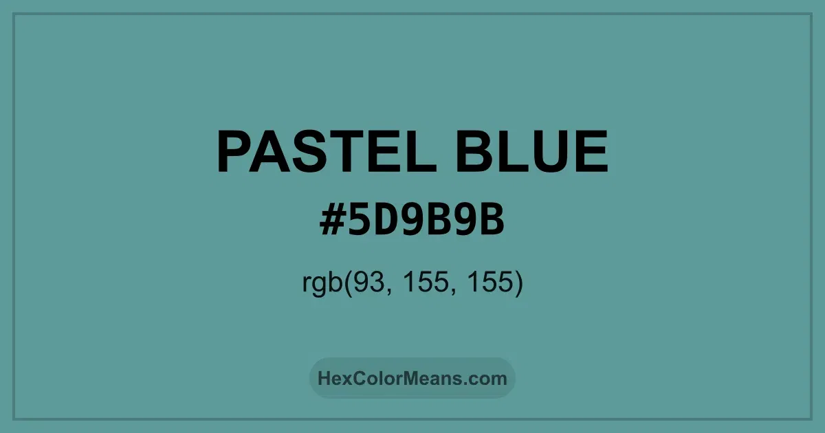
Pastel Blue (#5d9b9b) Color Information
Pastel Blue (#5d9b9b) RGB value is (93, 155, 155). The hex color red value is 93, green is 155, and blue is 155. Its HSL format shows a hue of 180°, saturation of 25%, and lightness of 49%, while the CMYK process values are 40%, 0%, 0%, and 39%.
Colors that pair well with Pastel Blue (#5d9b9b) include Eucalyptus (#5F8575), Rackley (#5D8AA8), and Antique Fuchsia (#915C83), as they maintain visual balance and harmony, whereas Purpureus (#9A4EAE), Grey Beige (#9E9764), and Copper Rose (#996666) tend to conflict with this color due to strong contrast or opposing tonal characteristics.

Pastel Blue (#5d9b9b) Color Meaning
Pastel Blue (#5D9B9B) is a muted, teal-like shade of blue, softer than turquoise but deeper than sky blue. It belongs to the blue family with green undertones. Historically, soft blue-green tones appeared in coastal art, textiles, and Mediterranean design. This color conveys calm, trust, and subtle energy. Pastel Blue (#5D9B9B) is often used in offices, bedrooms, and creative spaces to promote serenity. Its balance of cool and warm undertones makes it versatile in design. In various traditions, blue-green shades symbolize protection, peace, and renewal. In Asian art, teal tones often represent water, life, and harmony. Pastel Blue (#5D9B9B) also supports meditation and emotional balance, encouraging clear thinking and relaxation.
Color Conversion
Accurate conversions of Pastel Blue (#5d9b9b) across RGB, Hex, CMYK, HSL, and Lab ensure consistent color fidelity across digital, print, and design applications.
RGB Values & CMYK Values
Detailed RGB and CMYK values of Pastel Blue (#5d9b9b) displayed in a horizontal bar provide clear reference for digital and print color accuracy.
RGB Channels
CMYK Ink Density
Color Variations
A full range of Pastel Blue (#5d9b9b) variations, including tints, shades, and tones, provides highlights, depth, and subtle desaturated options for UI design.
Color Harmonies
Harmonious color schemes for Pastel Blue (#5d9b9b) created using the color wheel ensure visually balanced palettes.
Analogous
Colors adjacent on the color wheel (30° apart)
Complementary
Colors opposite on the color wheel (180° apart)
Split Complementary
Three colors using one base hue and the two hues beside its opposite
Triadic
Three colors evenly spaced (120° apart)
Tetradic
Four colors forming a rectangle on the wheel
Square
Four colors evenly spaced (90° apart)
Double Split Complementary
Four colors formed from two base hues and the colors next to their opposites
Monochromatic
Variations of a single hue
Contrast Checker (WCAG)
Luminance contrast ratios for Pastel Blue (#5d9b9b) against standard backgrounds ensure readable, accessible text following Contrast Checker and WCAG 2.1 AA/AAA standards.
Sample Text
This is how your text will look with these colors.
Large Text (18pt+)
Normal Text
UI Components
Color Blindness Simulator
Simulated views of Pastel Blue (#5d9b9b) for different color vision deficiencies help identify potential confusion using the Color Blindness Simulator.
Normal Vision
protanopia
Note: These simulations are approximations. Actual color vision deficiency varies by individual.
CSS Examples
Background Color
Text Color
Sample Text
Border Color
Box Shadow
Text Shadow
Sample Text
Gradient
Seamless Patterns
High-resolution seamless patterns featuring Pastel Blue (#5d9b9b) provide ready-to-use backgrounds, wallpapers, and print designs for any project.
Icons
A collection of popular icons in Pastel Blue (#5d9b9b) offers ready-to-use visuals for interfaces, designs, and creative projects.
Real-World Applications
Real-world mockups of Pastel Blue (#5d9b9b) showcase its versatility across fashion, interiors, branding, and product packaging.
Useful Color Tools
A curated set of tools to help apply, analyze, and manage colors effectively in your projects
Pastel Blue (#5d9b9b) Color FAQs
Frequently asked questions about Pastel Blue (#5d9b9b) color meaning, symbolism, and applications. Click on any question to expand detailed answers.