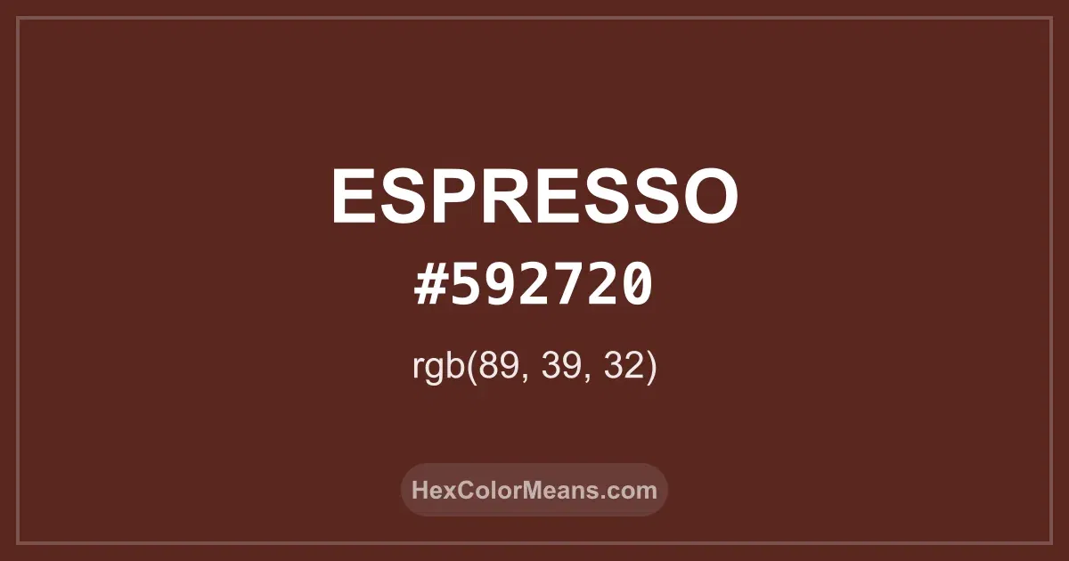
Espresso (#592720) Color Information
Espresso (#592720) RGB value is (89, 39, 32). The hex color red value is 89, green is 39, and blue is 32. Its HSL format shows a hue of 7°, saturation of 47%, and lightness of 24%, while the CMYK process values are 0%, 56%, 64%, and 65%.
Colors that pair well with Espresso (#592720) include Claret Violet (#641C34), Otter Brown (#654321), and Mint Green (#20603D), as they maintain visual balance and harmony, whereas Cal Poly Green (#1E4D2B), Signal Blue (#1E2460), and Pine Green (#2C5545) tend to conflict with this color due to strong contrast or opposing tonal characteristics.

Espresso (#592720) Color Meaning
Espresso (#592720) belongs to deep brown reds with roasted intensity. It mirrors brewed coffee and dark soil. The shade feels rich and dense. Espresso (#592720) carries weight. Symbolically, Espresso (#592720) represents focus, endurance, and ritual. It connects with routine and alertness. In color psychology, dark warm browns support stability and seriousness. Espresso (#592720) feels steady. Culturally, espresso tones link to cafés, conversation, and craft. Coffee shaped social life and trade routes. In design, Espresso (#592720) conveys depth and sophistication. The shade feels intimate.
Color Conversion
Accurate conversions of Espresso (#592720) across RGB, Hex, CMYK, HSL, and Lab ensure consistent color fidelity across digital, print, and design applications.
RGB Values & CMYK Values
Detailed RGB and CMYK values of Espresso (#592720) displayed in a horizontal bar provide clear reference for digital and print color accuracy.
RGB Channels
CMYK Ink Density
Color Variations
A full range of Espresso (#592720) variations, including tints, shades, and tones, provides highlights, depth, and subtle desaturated options for UI design.
Color Harmonies
Harmonious color schemes for Espresso (#592720) created using the color wheel ensure visually balanced palettes.
Analogous
Colors adjacent on the color wheel (30° apart)
Complementary
Colors opposite on the color wheel (180° apart)
Split Complementary
Three colors using one base hue and the two hues beside its opposite
Triadic
Three colors evenly spaced (120° apart)
Tetradic
Four colors forming a rectangle on the wheel
Square
Four colors evenly spaced (90° apart)
Double Split Complementary
Four colors formed from two base hues and the colors next to their opposites
Monochromatic
Variations of a single hue
Contrast Checker (WCAG)
Luminance contrast ratios for Espresso (#592720) against standard backgrounds ensure readable, accessible text following Contrast Checker and WCAG 2.1 AA/AAA standards.
Sample Text
This is how your text will look with these colors.
Large Text (18pt+)
Normal Text
UI Components
Color Blindness Simulator
Simulated views of Espresso (#592720) for different color vision deficiencies help identify potential confusion using the Color Blindness Simulator.
Normal Vision
protanopia
Note: These simulations are approximations. Actual color vision deficiency varies by individual.
CSS Examples
Background Color
Text Color
Sample Text
Border Color
Box Shadow
Text Shadow
Sample Text
Gradient
Seamless Patterns
High-resolution seamless patterns featuring Espresso (#592720) provide ready-to-use backgrounds, wallpapers, and print designs for any project.
Icons
A collection of popular icons in Espresso (#592720) offers ready-to-use visuals for interfaces, designs, and creative projects.
Real-World Applications
Real-world mockups of Espresso (#592720) showcase its versatility across fashion, interiors, branding, and product packaging.
Useful Color Tools
A curated set of tools to help apply, analyze, and manage colors effectively in your projects
Espresso (#592720) Color FAQs
Frequently asked questions about Espresso (#592720) color meaning, symbolism, and applications. Click on any question to expand detailed answers.