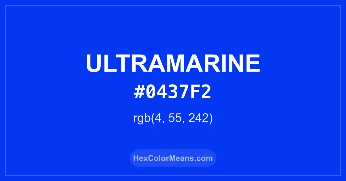
Ultramarine (#0437f2) Color Information
Ultramarine (#0437f2) RGB value is (4, 55, 242). The hex color red value is 4, green is 55, and blue is 242. Its HSL format shows a hue of 227°, saturation of 97%, and lightness of 48%, while the CMYK process values are 98%, 77%, 0%, and 5%.
Colors that pair well with Ultramarine (#0437f2) include Vivid Cerulean (#00AAEE), Electric Ultramarine (#3F00FF), and Molten Orange (#F04A00), as they maintain visual balance and harmony, whereas Red (Munsell) (#F2003C), Harlequin (#3FFF00), and Golden Poppy (#FCC200) tend to conflict with this color due to strong contrast or opposing tonal characteristics.

Ultramarine (#0437f2) Color Meaning
Ultramarine (#0437F2) sits in the intense blue range with vivid saturation. It reflects depth and richness without darkness. This makes Ultramarine (#0437F2) visually commanding and clear. Artists rely on it for strong contrast and emphasis. Symbolism linked to Ultramarine (#0437F2) centers on truth and devotion. It feels serious and intentional. In color psychology, Ultramarine (#0437F2) supports focus and intellectual discipline. That explains its presence in academic and artistic traditions. Historically, Ultramarine (#0437F2) came from crushed lapis lazuli imported across seas. Painters reserved it for sacred figures and important elements. The cost alone elevated its meaning. These origins give Ultramarine (#0437F2) lasting prestige.
Color Conversion
Accurate conversions of Ultramarine (#0437f2) across RGB, Hex, CMYK, HSL, and Lab ensure consistent color fidelity across digital, print, and design applications.
RGB Values & CMYK Values
Detailed RGB and CMYK values of Ultramarine (#0437f2) displayed in a horizontal bar provide clear reference for digital and print color accuracy.
RGB Channels
CMYK Ink Density
Color Variations
A full range of Ultramarine (#0437f2) variations, including tints, shades, and tones, provides highlights, depth, and subtle desaturated options for UI design.
Color Harmonies
Harmonious color schemes for Ultramarine (#0437f2) created using the color wheel ensure visually balanced palettes.
Analogous
Colors adjacent on the color wheel (30° apart)
Complementary
Colors opposite on the color wheel (180° apart)
Split Complementary
Three colors using one base hue and the two hues beside its opposite
Triadic
Three colors evenly spaced (120° apart)
Tetradic
Four colors forming a rectangle on the wheel
Square
Four colors evenly spaced (90° apart)
Double Split Complementary
Four colors formed from two base hues and the colors next to their opposites
Monochromatic
Variations of a single hue
Contrast Checker (WCAG)
Luminance contrast ratios for Ultramarine (#0437f2) against standard backgrounds ensure readable, accessible text following Contrast Checker and WCAG 2.1 AA/AAA standards.
Sample Text
This is how your text will look with these colors.
Large Text (18pt+)
Normal Text
UI Components
Color Blindness Simulator
Simulated views of Ultramarine (#0437f2) for different color vision deficiencies help identify potential confusion using the Color Blindness Simulator.
Normal Vision
protanopia
Note: These simulations are approximations. Actual color vision deficiency varies by individual.
CSS Examples
Background Color
Text Color
Sample Text
Border Color
Box Shadow
Text Shadow
Sample Text
Gradient
Seamless Patterns
High-resolution seamless patterns featuring Ultramarine (#0437f2) provide ready-to-use backgrounds, wallpapers, and print designs for any project.
Icons
A collection of popular icons in Ultramarine (#0437f2) offers ready-to-use visuals for interfaces, designs, and creative projects.
Real-World Applications
Real-world mockups of Ultramarine (#0437f2) showcase its versatility across fashion, interiors, branding, and product packaging.
Useful Color Tools
A curated set of tools to help apply, analyze, and manage colors effectively in your projects
Ultramarine (#0437f2) Color FAQs
Frequently asked questions about Ultramarine (#0437f2) color meaning, symbolism, and applications. Click on any question to expand detailed answers.