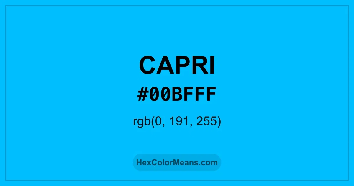
Capri (#00bfff) Color Information
Capri (#00bfff) RGB value is (0, 191, 255). The hex color red value is 0, green is 191, and blue is 255. Its HSL format shows a hue of 195°, saturation of 100%, and lightness of 50%, while the CMYK process values are 100%, 25%, 0%, and 0%.
Colors that pair well with Capri (#00bfff) include Tropical Mint (#00FFBF), Blue (RYB) (#0247FE), and Electric Crimson (#FF003F), as they maintain visual balance and harmony, whereas Neon Rose (#FF00CC), Lemon Lime (#BFFF00), and Coquelicot (#FF3800) tend to conflict with this color due to strong contrast or opposing tonal characteristics.

Capri (#00bfff) Color Meaning
Capri (#00BFFF) is a bright, vivid cyan-blue with tropical undertones. It conveys clarity, energy, and freedom. The color evokes clear skies, ocean waters, and a sense of expansive openness, blending vibrancy with calm. Capri (#00BFFF) has been used in fashion, art, and coastal design to suggest leisure, optimism, and clarity. Bright blues like this symbolize communication, imagination, and visual freshness. In maritime and travel contexts, the color conveys exploration, clarity, and natural beauty. In modern contexts, Capri (#00BFFF) is applied in digital media, branding, and interiors to create attention, optimism, and visual engagement. Its vivid energy communicates innovation, refreshment, and openness, providing both vibrancy and clarity in design.
Color Conversion
Accurate conversions of Capri (#00bfff) across RGB, Hex, CMYK, HSL, and Lab ensure consistent color fidelity across digital, print, and design applications.
RGB Values & CMYK Values
Detailed RGB and CMYK values of Capri (#00bfff) displayed in a horizontal bar provide clear reference for digital and print color accuracy.
RGB Channels
CMYK Ink Density
Color Variations
A full range of Capri (#00bfff) variations, including tints, shades, and tones, provides highlights, depth, and subtle desaturated options for UI design.
Color Harmonies
Harmonious color schemes for Capri (#00bfff) created using the color wheel ensure visually balanced palettes.
Analogous
Colors adjacent on the color wheel (30° apart)
Complementary
Colors opposite on the color wheel (180° apart)
Split Complementary
Three colors using one base hue and the two hues beside its opposite
Triadic
Three colors evenly spaced (120° apart)
Tetradic
Four colors forming a rectangle on the wheel
Square
Four colors evenly spaced (90° apart)
Double Split Complementary
Four colors formed from two base hues and the colors next to their opposites
Monochromatic
Variations of a single hue
Contrast Checker (WCAG)
Luminance contrast ratios for Capri (#00bfff) against standard backgrounds ensure readable, accessible text following Contrast Checker and WCAG 2.1 AA/AAA standards.
Sample Text
This is how your text will look with these colors.
Large Text (18pt+)
Normal Text
UI Components
Color Blindness Simulator
Simulated views of Capri (#00bfff) for different color vision deficiencies help identify potential confusion using the Color Blindness Simulator.
Normal Vision
protanopia
Note: These simulations are approximations. Actual color vision deficiency varies by individual.
CSS Examples
Background Color
Text Color
Sample Text
Border Color
Box Shadow
Text Shadow
Sample Text
Gradient
Seamless Patterns
High-resolution seamless patterns featuring Capri (#00bfff) provide ready-to-use backgrounds, wallpapers, and print designs for any project.
Icons
A collection of popular icons in Capri (#00bfff) offers ready-to-use visuals for interfaces, designs, and creative projects.
Real-World Applications
Real-world mockups of Capri (#00bfff) showcase its versatility across fashion, interiors, branding, and product packaging.
Useful Color Tools
A curated set of tools to help apply, analyze, and manage colors effectively in your projects
Capri (#00bfff) Color FAQs
Frequently asked questions about Capri (#00bfff) color meaning, symbolism, and applications. Click on any question to expand detailed answers.